Literacy Campaign
Background
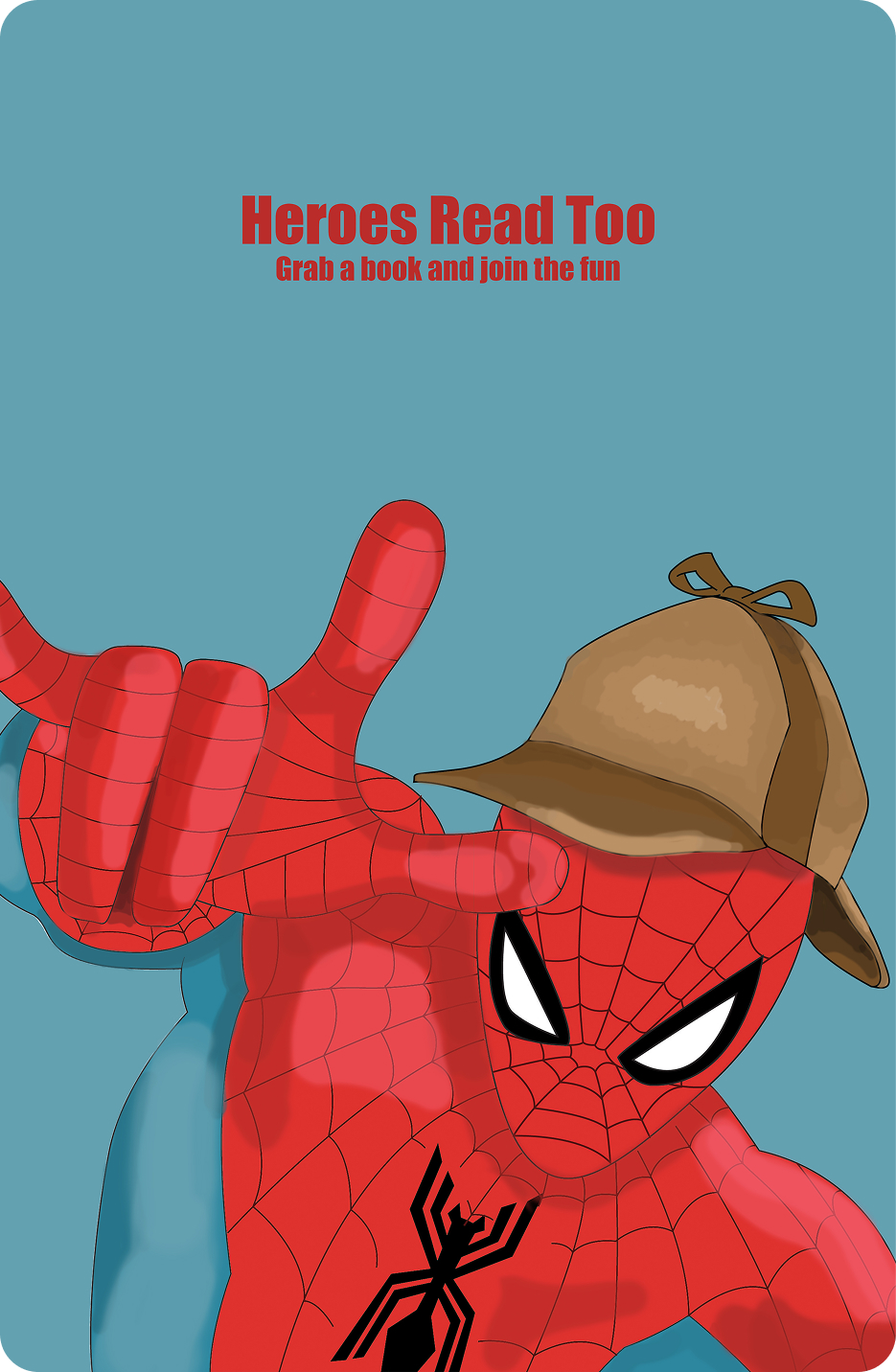
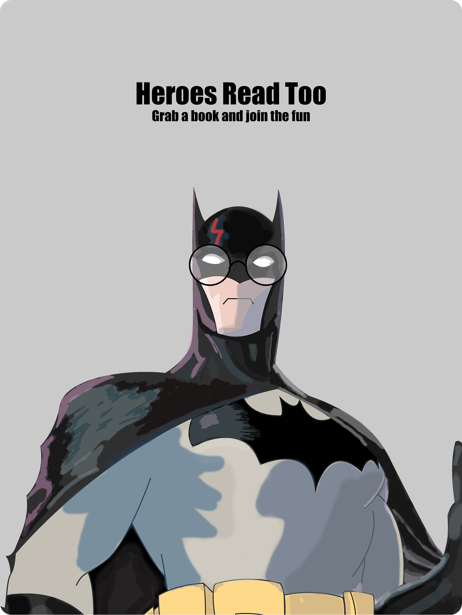
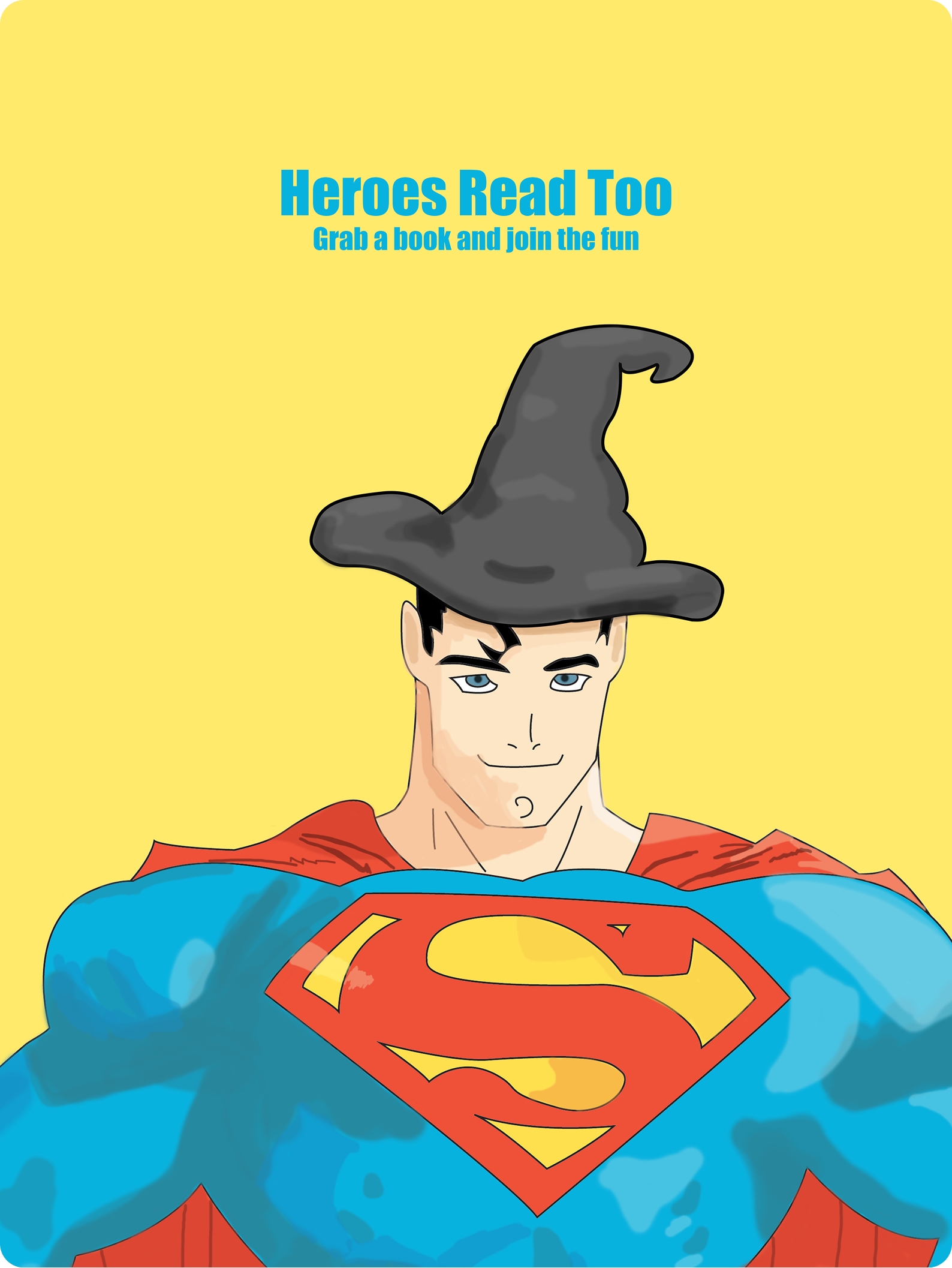
The point of these posters was to create a poster advertising reading to the next generation of children, aiming to paint reading as something that will inspire kids, and make it seem like something that is cool to do.
One of the first things I had to think about was what kids see as "cool" nowadays, which took a bit of thinking. Through brainstorming, I came up with the idea of superheroes, but didn't really have a way to tie them into reading yet.
In one of my preliminary sketches, I came up with a similar idea, except using book characters like Harry Potter instead of superheroes. I didn't go with that as the main idea because it didn't move me, I did not think that the characters from the stories were a good reason to read, because a kid who doesn't read would not know who the characters being depicted were.
I ended up going back over my sketches, and deciding on combining the two ideas, creating the original idea for the "Heroes Read Too" campaign.
Process
Once I was done with my sketching, I moved into the mockup phase. The original plan was to make something that looked more realistic, utilizing photography for someone in a Batman outfit, and then using photoshop to edit in the Harry Potter scar and glasses afterwards.
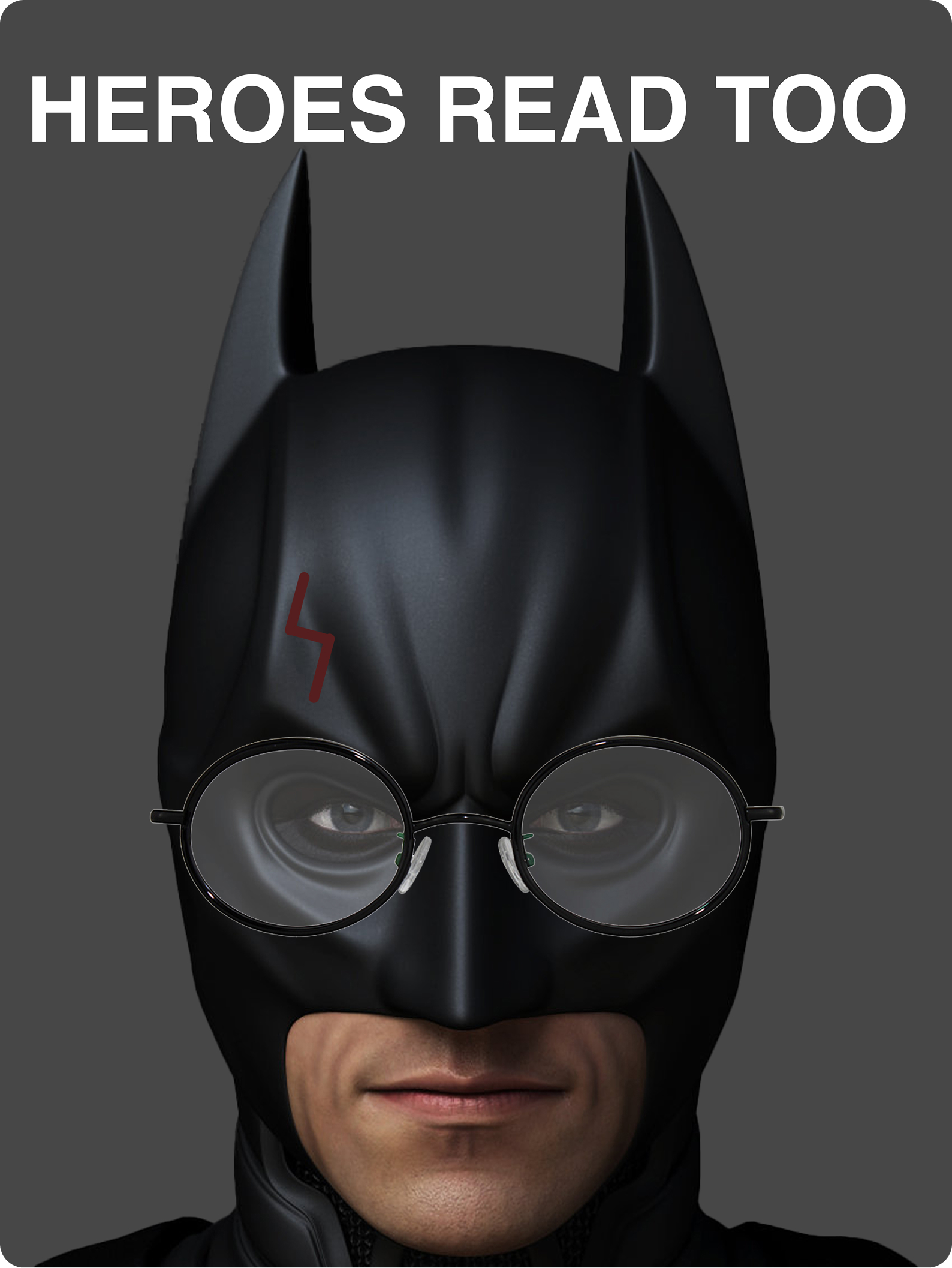
As we can see, there was something clearly wrong with this idea. There was something unsettling about the idea of the realistic batman, and I worried that it wouldn't come across as cool, so I had to switch my thinking up.
The next idea was to branch further into the illustrative side, which leaned into the comic book kind of aesthetic, which was the style that I ended up with. Once I moved into this style, I made the final Batman poster pretty quickly, and became inspired to create one for Spiderman and one for Superman, wrapping up 3 of the most popular superheroes
What I learned
The thing that this project really helped me sharpen was my ability to adapt, as it took me a decent amount of time to get to the final idea. I had a lot of ideas that just didn't pan out quite the way I wanted, and when I started to doubt the idea as a whole, I struck gold by adapting to my strengths.